 by
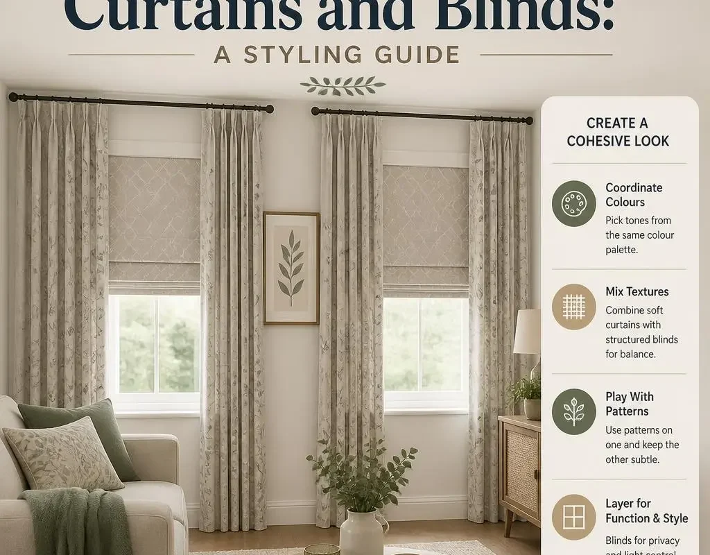
by Matching curtains and blinds isn’t really about finding identical fabric — done badly, that can flatten a window into the wall and make the treatment disappear entirely. This guide covers the actual decision points: exact match versus tonal match, pattern pairing, and how material choice affects which colours work together.

Exact Match vs. Tonal Match
An exact colour and fabric match between blind and curtain creates a seamless, unified look, particularly effective when you want the window treatment to recede rather than stand out. A tonal match — same colour family, different shades or textures — reads as more considered and layered, and hides small variations between different fabric batches better than a true exact match would. For most rooms, tonal matching is the more forgiving, easier-to-source option.
The Wall-Colour Trap
One mistake worth avoiding specifically: matching your curtains and blind exactly to your wall colour. Rather than looking deliberately minimal, this often makes the window treatment visually disappear into the wall, losing the window as a feature entirely. Keep at least a shade or two of contrast between the walls and the window treatment, even within an otherwise matched colour scheme.
Pairing Pattern With Plain
The most reliable formula for combining a patterned and a plain element is to pull one colour directly from the pattern and use it for the plain piece. A curtain with a botanical print in green, cream, and rust, for example, pairs naturally with a plain rust or green blind, since the colour connection is already built into the fabric rather than guessed at.
Complementary Rather Than Matching Colours
An alternative to matching is choosing complementary colours from opposite sides of the colour wheel — navy with warm orange tones, or deep purple with soft yellow. This creates more visual interest than a tonal match, but works best kept to one bold colour pairing rather than several competing hues in the same window.
How Material Affects Colour Choice
Wooden and faux-wood venetian blinds carry a naturally warm undertone, which pairs more easily with warm curtain colours (rust, mustard, terracotta) than with cool tones (icy blue, grey), which can clash slightly against the wood. Aluminium and PVC blinds are colour-neutral by comparison, so they pair equally well with warm or cool curtain palettes.
Using Existing Décor as a Starting Point
Rather than choosing curtain and blind colours in isolation, pull a colour already present in the room — a rug, a piece of art, a cushion — and build the window treatment around that. This naturally ties the window into the rest of the room’s colour scheme instead of introducing something disconnected from everything else in the space.
Testing Before Committing
Fabric colour can shift noticeably under different lighting throughout the day, so it’s worth taping fabric samples directly onto the window frame and observing them at different times before ordering both pieces in full. This is particularly important for a tonal match, where subtle colour differences are the whole point, and matter more than they would with a bold contrast pairing.
Frequently Asked Questions
Should curtains and blinds always be the same colour?
No. A tonal match or a deliberate complementary contrast often looks more considered than an exact colour match, and gives more flexibility when sourcing fabric.
Is it a mistake to match curtains to the wall colour?
It can be, since matching too closely often makes the window treatment disappear into the wall rather than reading as a deliberate design choice.
How do I choose a colour if my blind is wooden?
Lean towards warm curtain tones, such as rust, mustard, or terracotta, since these generally sit better against the natural warmth of wood than cool blues or greys.